Complex Name Element

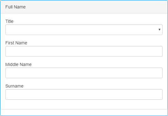
The Complex Name Element provides a means to allow users to enter a name in a single Element. This complex Element allows you to provide Prefix, First Name, Middle Name and Surname fields with the Prefix and Middle Name fields able to be hidden, if not required.
The Prefix field allows you to provide a list of titles, such as Mr, Mrs, Miss etc., from which the user can select the appropriate one from a drop-down list. You can enter the list of items manually or read them in from a Datasource (see Properties below).
The Prefix list can be populated under the Property's Data tab. To specify the list items manually, enter a series of comma separated values in the Custom List Property. To populate the list from a Datasource, use the List Items Property to display the Recordset Builder pop-up which allows you to create and populate a new database especially for your required values or to specify a Datasource and relevant Dataset from which the values will be extracted. The Recordset Builder pop-up operates in the same way as it does for the standard Drop List Element.
Specifying a data mapping will take priority over a hard-coded list entered in the Custom List Property.
Once you have placed a Complex Name Element on a page, you can edit the Element's properties to configure the Element for your requirements. Select the Element on the page to display its properties in the Properties Pane.
The following properties are available:
Label
Allows you to specify the text that appears in the Element's heading. You can change the default label to provide more meaningful text for your users.
Prefix Label, First Name Label, Middle Name Label and Surname Label
Allow you to specify the text for the labels for each of the fields within the Element.

Visible and Disabled Properties
Display Prefix
Allows you to show or hide the Prefix field. Select the checkbox to include the Prefix field, deselect it to hide this field.
Display Middle Name
Allows you to show or hide the Middle Name field. Select the checkbox to include the Middle Name field, deselect it to hide this field.

The properties in this section allow you to specify validation criteria for the Element. Validations supported are Required and Max Length but validation error messages are built-in to the Element and any Failure error messages specified within the Rules will be ignored.
You can specify different validation criteria for each line within the Element.
If you have upgraded a project created using a version of Digitise Forms earlier than Digitise Forms - 2021 Spring Update and you have upgraded the Elements on the form to the latest versions, the Rules settings for the Complex Name Element will be slightly different to those available in the earlier version of the Element. From Digitise Forms - 2021 Spring Update onwards, you can specify a Rule for each item in the Element, whereas previously the validation rules were set for the whole Element. When you upgrade to the latest version of the Complex Name Element, the new validation properties will be set to best match the behaviour of the original Element. We suggest you check the validation Rules after upgrading the Element and adjust them if required.

The Prefix field allows you to provide a list of titles, such as Mr, Mrs, Miss etc., from which the user can select the appropriate one. It uses a standard Drop List Element to display the available values and allow the user to make their selection. You can either manually enter the values to be displayed in the list or read them in from a Datasource.
To specify the list items manually, enter a series of comma separated values in the Custom List Property.
To populate the list from a Datasource, use the List Items Property to display the Recordset Builder pop-up which allows you to create and populate a new database especially for your required values or to specify an existing Datasource and Dataset from which the values will be extracted. This property operates in the same way as the List Items property under the standard Drop List Element - see the
If you specify a data mapping in the List Items Property, any values in the Custom List Property will be ignored.
In addition to specifying the values to be used to populate the Prefix field list, the Data tab also allows you to specify an input and/or output mapping for each of the four fields. The remaining properties under this tab allow you to specify these mappings in the same way as you would for standard Drop List and Text Box Elements - see Data Tab Properties.
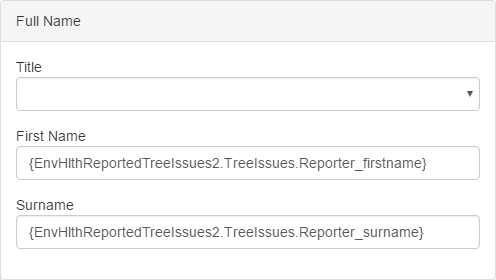
If you specify an input mapping for any of the fields, the mapping will be displayed in the appropriate field within the Form Design workspace, in the format {<datasource>.<dataset>.<dataitem>}. For example the following Complex Name Element has an input mapping defined for the First Name and Surname fields:

You may need to reload the form to display the input mapping. The mapping is only shown in Form Studio and isn't displayed on the published form.
 Advanced Tab
Behaviour Category
Max Length properties
These properties specify the maximum number of characters a user can type into the First Name, Middle Name and Surname text boxes at runtime. The value can be specified separately for each text box. The default value is -1, which means there is no limit specified.
Note, however, that if you output map a Text Box within the Complex Name, the maximum number of characters which can be entered into that Text Box at runtime will be the smaller of the output mapped Dataset column's width setting or the value specified here in the Max Length property. For example, suppose you specify a Max Length of 50 and then output map the Text Box to a Dataset column which has a Max Length of 35, the Text Box will be restricted to 35 characters at runtime. You can check the maximum width of a column under the Mappings tab for the relevant Dataset.
Note also that this property only takes effect on text boxes which have an output mapping specified.
Styles Category
Label, Body and Error Message
Allow you to assign a style to the label, body and invalid data error message text, respectively, e.g. to set the font type, size and colour.